After sifting through so many trash onboarding emails that completely miss so many marks, it was nice to finally see one that did what it’s supposed to.
I signed up for Hunter.io two days ago, and their onboarding emails have not disappointed.
The one thing most SaaS onboarding messages usually do is BEG.
They use onboarding emails to beg you to come back to the product you just signed up for. They sound desperate for you to come back.
And just like in life, desperation in emails repels people instead of pulling them.
Messages like:
“Don’t miss out on your product, it’s just sitting here waiting for you.”
Yeah no shit, I just signed up for it. I get it. People forget and you do have to address that. But you don’t do that by begging. You do that by re-enticing. By showing them they’re in the right place.
Let’s Get Into the Breakdown Shall We?
Hunter.io starts doing things well right off the bat. In their first email in fact.
What Hunter.io Onboarding Email #1 Gets Right…
Email #1 might seem simple, but psychologically it tugs on a lot of the right strings for the new user. They do a LOT of good shit in this one.
Here’s the email…
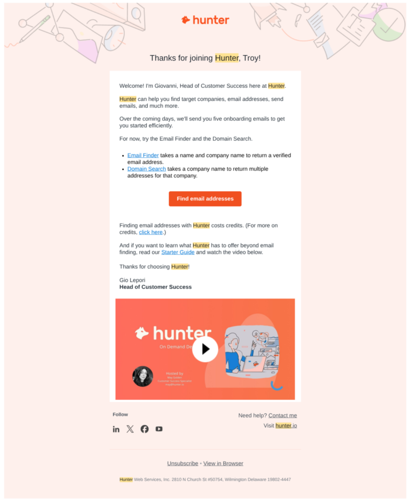
As you can see, this email is not all glossy and fancy. The background is a little outdated. But the messaging makes all that not matter so much.
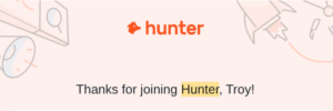
Hunter Warmly Welcomes You to Their Home
The first thing they do is exactly what they’re supposed to. WELCOME you in a warm way. It makes the new user feel like they just made a good decision by simply being warm and friendly.
They’re inviting you in, like visiting a new friend’s home. Hey, thanks for coming over.
A Real Person Behind the Message
Email #1 introduces your new friend with a name.
That’s smart, because now you’re getting an email from a person, not an app. People connect with people, and in the age of AI, that’s becoming even more important.
Now I’m not walking into an empty home. I’ve got a person talking to me.
Compare that to this welcome email from Liven once you take their quiz…
This is more like a doctor with no bedside manner.
“Here’s your results, go to the front and make an appointment.”
It’s obnoxious, and got no action from me.
And my ADHD ass could probably use this app.
Hunter Reminds You WHY You’re There in the First Place
The email also quickly reminds you why you signed up by telling you as clearly as day what Hunter.io is used for.
“Hunter can help you find target companies, email addresses, send emails, and much more.”
This might seem obvious but most people don’t sign up for an app and then automatically go check their email.
So if you see this email a couple hours later like I did, you may not even remember who the hell they were.
Now not only do they remind you, but that single line lets you see yourself using it, and getting results.
It plants a seed in your mind that this tool is valuable.
And frankly, even when signing up, I wasn’t exactly sure what all Hunter did.
The copywriter who wrote this email (who are you? Let’s be friends) knows that other people will be in the same boat. It’s a subtle reminder that goes a long way.
You get that info from customer feedback, complaints, chats, etc. It’s gold that this copywriter mined well.
After that, this email goes right into telling you what to expect next.
“Over the coming days, we’ll send you five onboarding emails to get you started efficiently.”
The human mind loves to know what to expect next. We also don’t like to be left alone in new territory. This line gives you comfort, while at the same time increasing the chances that you’ll open the next message.
What a Restaurant Can Teach You About Email Marketing…
There’s a stat from Jon Taffer of Bar Rescue that stuck with me. Even after a flawless restaurant experience, customers only come back about 40% of the time. Second visit bumps that to the low 50s.
But if they come back a third time, retention jumps to over 70%.
Email works the same way. So you want to get people visiting as many times as possible within the first few days or they’re lost.
That’s exactly what this email does right away. Check out what they do:
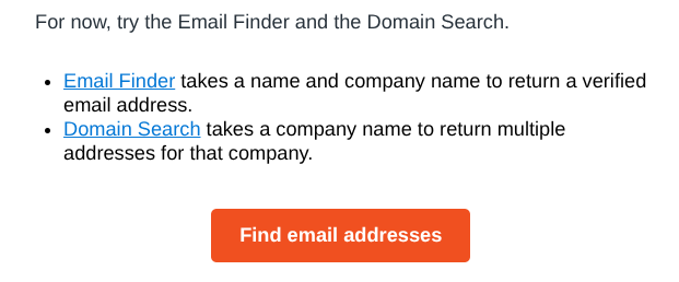
Three links back to the site, perfectly placed, in one little section.
The link text tells you exactly where it’ll lead you, and the text that follows tells you exactly what it does once you get there.
My only little gripe on this is the button. I think people are too obsessed about short button copy.
I would test “Find the Email Address You Need” here.
Yes, it makes the button wider. So what?
The reason people are using Hunter is because they need to find an email address. That’s what I was there for.
“Find the Email Address You Need” just carries on the conversation already in your head.
Next thing they do well is gently answer a question in the reader’s mind.
“Finding email addresses with Hunter costs credits. (For more on credits, click here.)”
Hesitation is the Killer of Forward Momentum in Lifecycle
If someone is hesitating, even if just because they’re not sure about something, that could end their journey over to the app.
Hunter’s copywriter kills that here.
Then they get you over to where the money is made, on the app.
Eliminate As Much Hesitation As Possible Right Away
Credits obviously aren’t the only speed bump that stops people from heading over to the app. You ever sign up for something, and in your head it sounds like it’s gonna be more of a pain in the ass to figure out how to use the tool. So you procrastinate.
This email goes into the fear of not knowing how to use the product. Or put a better way, what to do next.
We’ve all hesitated because of that. I do that all the time because I’m a dope when it comes to techy stuff. I feel like it’s just going to be a headache. 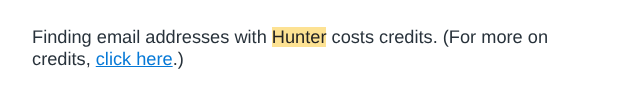
That single line in this email addresses that perfectly:
So this next section is for the techy dopes like me.
Not only does the copywriter lead you directly to the “Starter Guide” (perfectly titled so you know exactly what you’re clicking), but for lazy ass people like me, they also give you the option to watch an explainer video.
As you can see, this email is CONSTANTLY getting you back to the app in useful ways.
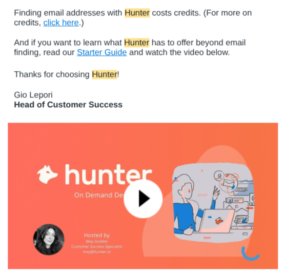
The app is where the money is made with credits, upgrades, and retention.
That’s where you want people, so don’t be shy about getting them there.
So a quick summary of what email does right…
✅ It gives you a warm welcome, making you feel good about your decision.
✅ It’s from a real human, not just the app.
✅ Reminds you exactly why you signed up in the first place.
✅ Shows you what to expect next (helps future opens)
✅ Almost immediately gets you back to the app
✅ Uses well-defined links and a reason to click.
✅ The copywriter answers the big question that’s likely in the reader’s head
✅ Leads you to a “Starter Guide” where more of your questions can be answered.
✅ Gives lazy people like me an option to watch a video instead.
✅ Overall, constantly guides you back to the page.
Note: This was a glowing review. These are rare. I’ll be tearing those trash emails apart plenty. So don’t get used to Mr. Nice Guy you saw here today. 😜